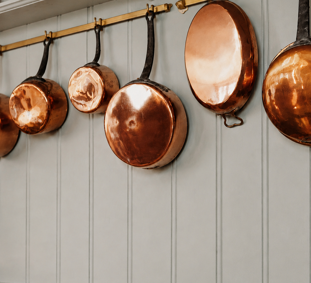
The best color for your kitchen depends on where in your home it is located. Colors interact with us in very specific ways, so it is wise to explore options that can best support your wellbeing at home. The approach I use is based on classical feng shui, where colors are chosen based on the kitchen’s location and defined by the home energy map called the bagua (read about bagua here). This simple guide should help you choose best colors for your kitchen based on its location in your home, as well as know which colors to avoid.
South Facing Kitchen (157.5°-202.5°)
This is considered a really good location for the kitchen because it works very well with the fiery, warm and active energy of the South direction. A South-facing kitchen can benefit from a wide variety of colors, from bold red to saturated yellow, orange and even pink. All green and brown colors are also considered very good here, because they support the Fire element of the South area. Colors that are best to avoid (in big proportions) are blue and black.
Southwest Facing Kitchen (202.5°-247.5°)
A kitchen located in the Southwest of your home is also considered easy to work with, color-wise. The fire energy of the kitchen nourishes this direction naturally, which means warm, vibrant colors work beautifully here: deep reds, saturated yellows, bright orange. Earthy colors are also excellent in a Southwest kitchen. Best to avoid a strong presence of white, gray, blue and black.

West Facing Kitchen (247.5°-292.5°)
If your kitchen is in the West, there is a bit more care required as the fire energy of the kitchen can weaken the energy of the Metal element this direction needs. Avoid strong fiery tones here (a red or bright yellow wall, for example, would not be a good choice) and lean instead toward earthy, grounding tones. Fresh whites and warm grays work especially well in a West-facing kitchen.
Northwest Facing Kitchen (292.5°-337.5°)
A kitchen in the Northwest needs the same colors as a kitchen in the West because they both share the same energetic needs of the Metal element. So, have an abundance of warm earthy colors, as well as crisp whites and fresh grays. Best to avoid all fiery colors, as well as black and blue.
North Facing Kitchen (337.5°-22.5°)
Finding best colors for a kitchen in the North requires some balancing. The direction in itself loves white, black, gray and blue, but the kitchen, in its essence, needs fiery energy. So the work comes in harmonizing these needs and expressing them in colors that look good in your specific kitchen. The easiest choice is to go for white or gray, with just some additions of warm fiery tones.
Northeast Facing Kitchen (22.5°-67.5°)
A kitchen in the Northeast is as easy to work with as a kitchen in Southwest as they have the same needs of Fire and Earth elements. This means you can freely use a variety of fiery colors here, from bright red to vibrant yellow and orange, as well as nourishing earthy tones. Colors to avoid are black, blue, white and gray.
East Facing Kitchen (67.5°-112.5°)
An East-facing kitchen benefits from some care. It is best to limit strong fiery colors here and lean toward nourishing earthy tones. Green and brown colors (Wood element) work especially well, and so do blue and black accents. Avoid a predominantly white color scheme here.
Southeast Facing Kitchen (112.5°-157.5°)
A Southeast kitchen needs the same exact care as the East-facing one. This means avoiding a strong presence of fiery colors and limiting a predominantly white color scheme. Best colors are earthy, green, brown, blue and black.

Kitchen in the Center
A kitchen in the center of your home is happy with the same treatment as the one in Southwest or Northeast areas; they have the same elemental needs. So fiery energy colors, from bright red to orange to saturated yellow, as well as nourishing earthy tones are all excellent here. Colors to limit, as a strong presence in this kitchen are white, gray, blue and black.
So there you have it, a practical guide to choosing best colors for your kitchen. The good thing to know is that there is no universal best feng shui color; it all depends on your specific kitchen and most definitely, on what you really like and would enjoy seeing there everyday.

Rodika Tchi works with private clients worldwide to create homes that support health, relationships and daily life. She is the author of two published books and has been interviewed by Psychology Today, Business Insider and Elle Décor.
Share


